One of the simplest, yet most powerful financial tools used by businesses of all types is the Trailing 12 chart (or 12-month Rolling Average). These charts show the true trends of almost any business metric. They are simple, clear, and useful for making rapid and timely decisions that impact your business.
What is it?
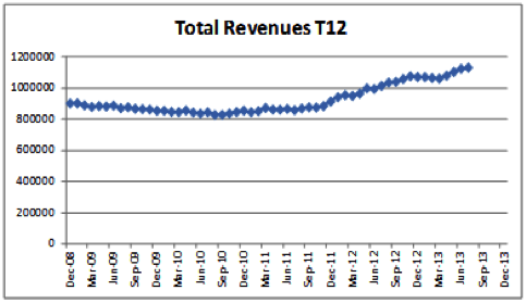
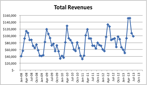
The Trailing 12 chart plots 12-month averages by month. In other words, each data point on the chart represents the most recent 12 months of data. See below the comparison of the same total revenue data in a T12 format versus a chart with revenue by month. This is the same data in both charts!
Why is it so powerful?
Since each data point represents 12 months of data, there is no seasonality in the trend line on the chart. If your line is going up, that is good. If your line is going down, that is bad. It's that simple and that powerful. You can watch the trends both in the short term and long term, and you can see the impact of your decisions very clearly. A good resource regarding these charts is at www.ceotools.com. Kraig Kramers, a renowned CEO, turnaround specialist, and business advisor was the founder and author of the book, CEO Tools, which is highly recommended.
Use this Trailing 12 chart format to monitor inventory costs, labor costs, and accounts receivable, and many others. As discussed previously, select a handful of the most impactful metrics and get started today. Use the data dashboard at IsMyPracticeHealthy.com to track revenues, transactions, inventory, and payroll. Those four metrics will help you significantly.
